Case #2 - Usability Donation App

About
This case study focuses on improving the usability of a donation and event app. We redesigned key flows—like registration and message sharing—and tested them with users to measure improvements in clarity, speed, and satisfaction.
Problem/Statement
Users faced challenges completing key actions—like registering for events and sharing fundraising messages—due to confusing navigation, lack of labels, and repetitive inputs in the original app design.
Goal/Objective
Test whether redesigned user flows improved completion, efficiency, and satisfaction for key actions like event registration and message sharing.
Research Methods
We conducted a comprehensive usability evaluation to identify design barriers, with a strong focus on accessibility and Jakob Nielsen’s heuristics. Our team collected findings that influenced design decisions and presented them in a structured format. We then redesigned key features and used UserTesting.com to compare the original version with the improved prototype. After analyzing user feedback, we delivered a final presentation of insights and actionable recommendations to the company’s stakeholders.
Task Design
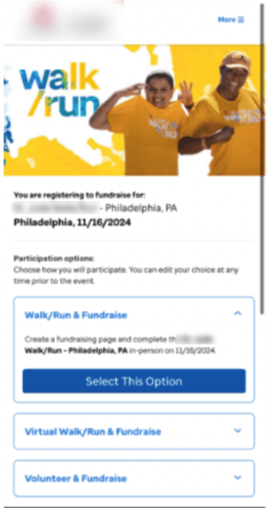


Participants were asked to complete the registration process within the app, including account creation and event sign-up.
Participants were tasked with sharing a fundraising message on social media using the app’s existing and proposed designs.
Result
Average Time to Completion

User Satisfaction


Overall User Preference Analysis


Conclusion
The usability study showed clear improvements with the redesigned prototypes. Task completion rates reached 100% for both registration and social sharing, compared to lower rates in the original version. User satisfaction jumped to 86% (5/5 ratings), up from 36% and 43%. Time on task was also reduced—13.5% faster for registration and 14.5% faster for social sharing. Enhancements like progress indicators and simplified flows made the experience smoother and more efficient.